
Website hero workflow
Website Hero Images Built Around the Message
Create a lifelike world with deliberate room for headlines, calls to action, and responsive crops—then use the same backplate as a standalone visual or a controlled product composite.
Start with the page promise
A website hero is the combined system of headline, supporting copy, call to action, and lead visual. Commission the image against that system. Define what the visitor should understand in the first few seconds, which action matters, and where the copy will sit before choosing a scene.
Use Create background under Manual tools for a standalone atmospheric visual or an empty backplate. Auto Studio starts from your product reference and combines scene planning, background generation, and AI-assisted product placement. Place product is the manual route when you want to select the background first. Compare AI placement with the reference and keep website headlines and calls to action as editable HTML.
Reserve copy-safe negative space
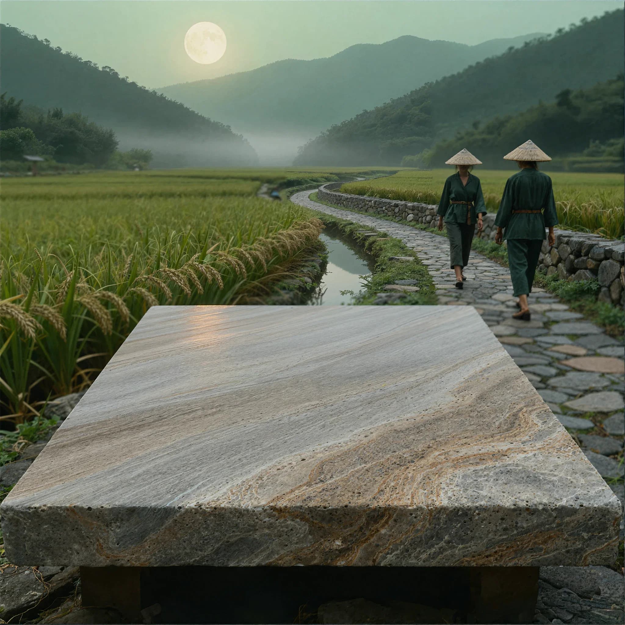
Copy-safe space must survive real content. Test the longest headline, localization, consent banners, navigation, and breakpoint changes. A quiet wall may work for text, but a controlled surface or open architectural area can also create usable space while maintaining depth.
Specify whether the safe zone belongs on the left, right, center, or upper third. Keep faces, high-contrast edges, and important narrative details outside it. If the product will be composited later, reserve a separate product plane so typography and product do not compete for the same area.
- Keep text as accessible HTML.
- Review contrast on every crop.
- Protect both CTA and product space.
Use real responsive art direction
A wide desktop backplate and a tall mobile hero solve different compositions. Automatic object-cover cropping can hide the context or enlarge a small portion until it appears soft. Build a portrait or mobile-safe variant that preserves the product plane, focal subject, and reading order.
Outpainting is useful when the world is right but the canvas is wrong. Extend the environment horizontally for desktop banners or vertically for mobile while preserving perspective and surface continuity. Then use a picture element or framework image component to deliver the intended asset at each breakpoint.
Ship a fast, measurable hero
Use responsive image sources, modern compression, a stable aspect or container, and early discovery for the actual LCP image. Do not preload gallery and demonstration assets far below the fold. Cache transformed variants at the edge when the delivery stack allows it.
Measure Hero CTA click-through, scroll depth, Create starts, and paid conversion alongside LCP, INP, and CLS. Test one major variable at a time. A visual swap is not automatically an improvement; the winning image is the one that supports the page promise for the intended audience.
Build a hero around your message.
Create a background, review the composition, and prepare the crops for your website.
Create a background