
21:9
Cinematic launch header
Maximum horizontal copy space
Desktop · mobile · responsive delivery
Choose the canvas from the layout, separate text, lifestyle, and product space, then deliver a deliberate composition for each breakpoint.
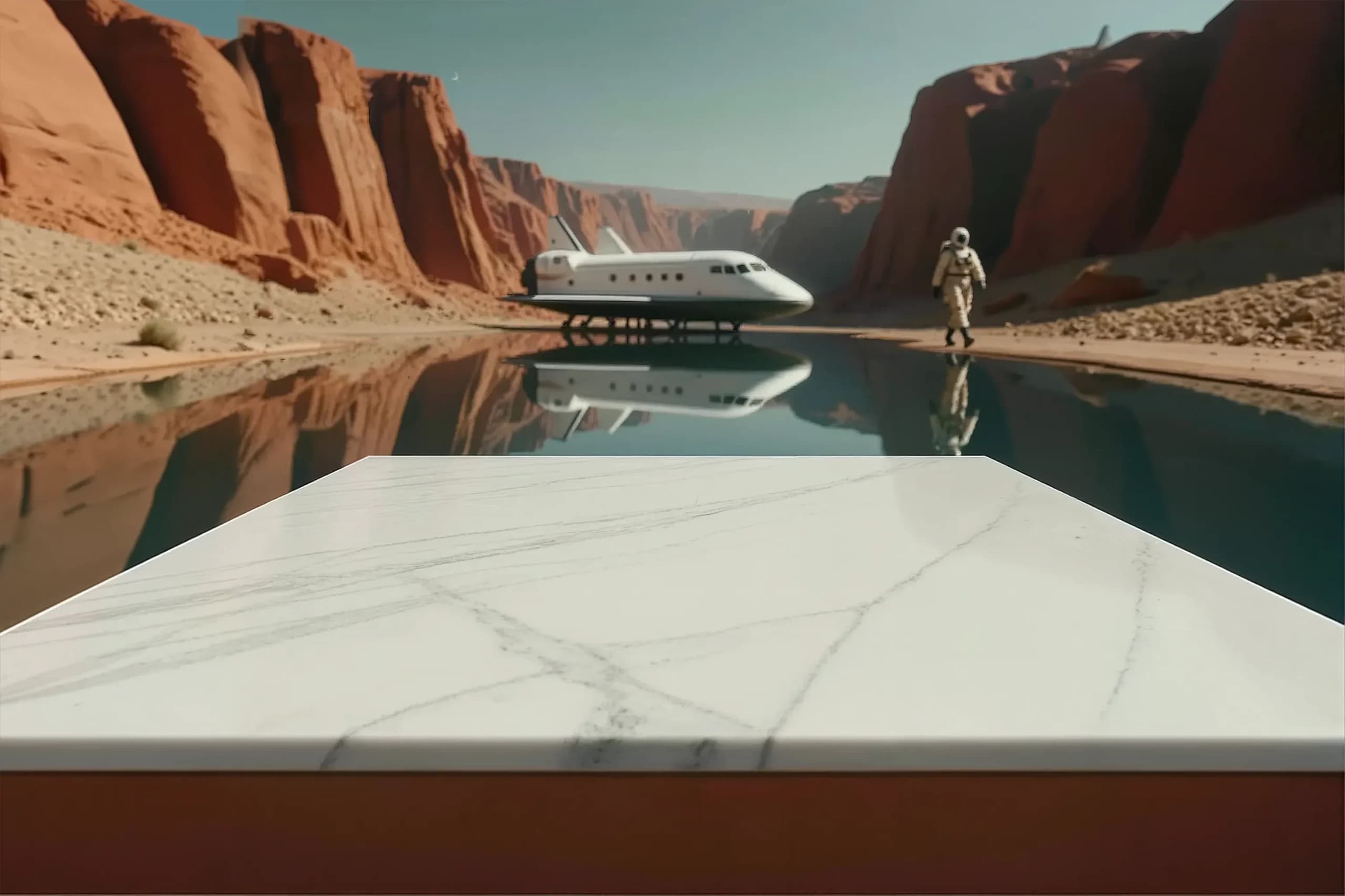
01 · Start with the slot
The correct canvas depends on the rendered container, content density, device, and crop behavior. Begin with the layout’s aspect ratio—not a generic upload recommendation.
Record the maximum CSS display width and likely device pixel ratio. Create a source large enough to remain sharp, then let the web layer deliver smaller responsive variants instead of shipping the master everywhere.
Maximum horizontal copy space
Reliable desktop starting point
More foreground and crop latitude
Stable across cards and galleries
Strong product and copy balance
Stories, reels, and vertical landing
02 · Three channels, three deliberate frames
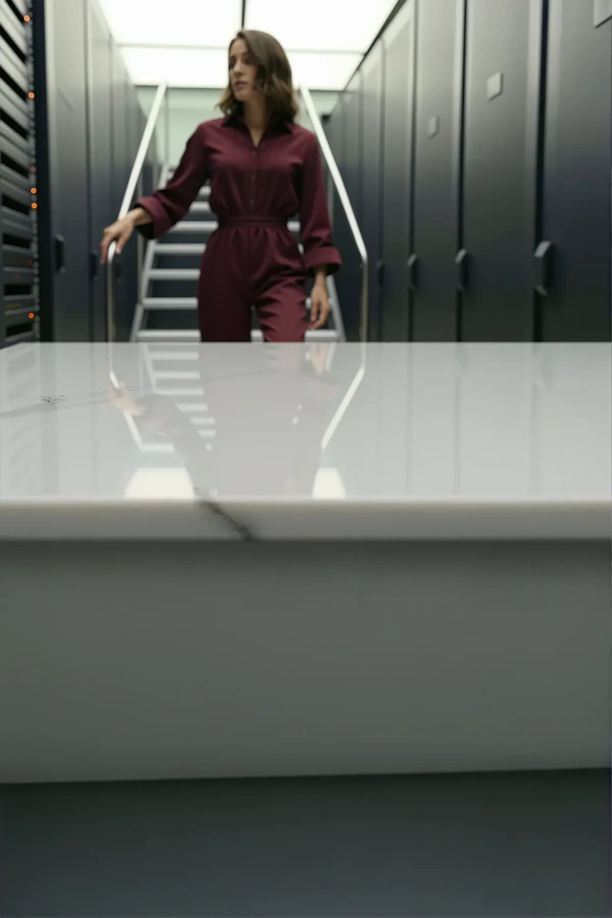
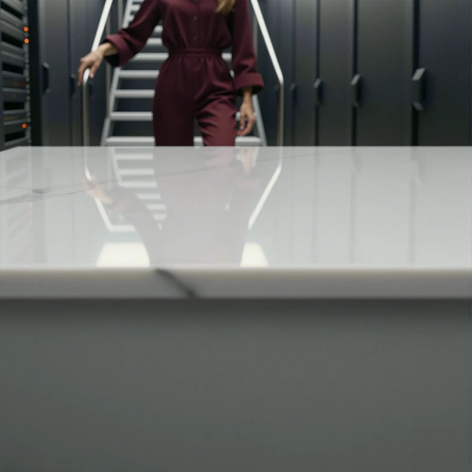
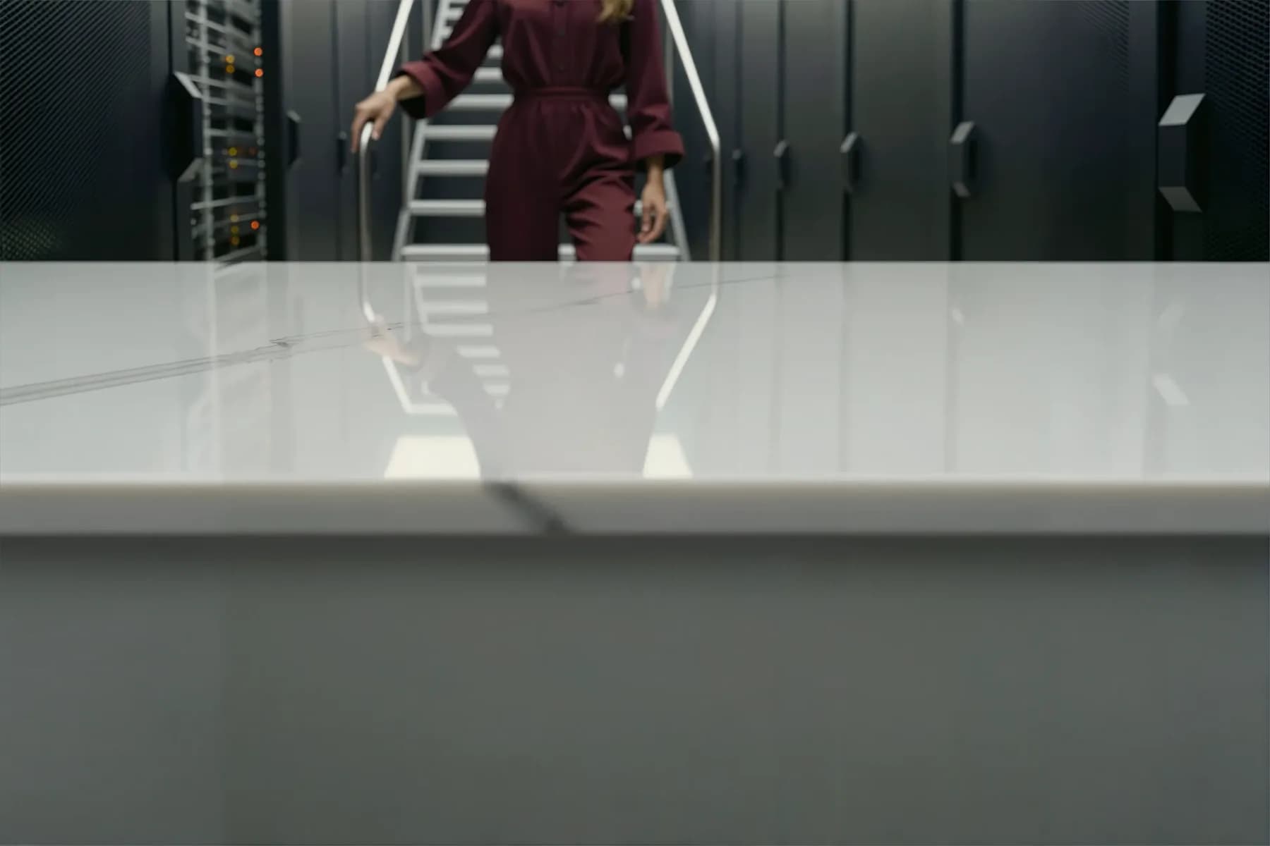
Published Discover results show how landscape, square, and portrait compositions protect different amounts of foreground, narrative context, and product space. The composition—not only the file dimensions—must fit the channel.
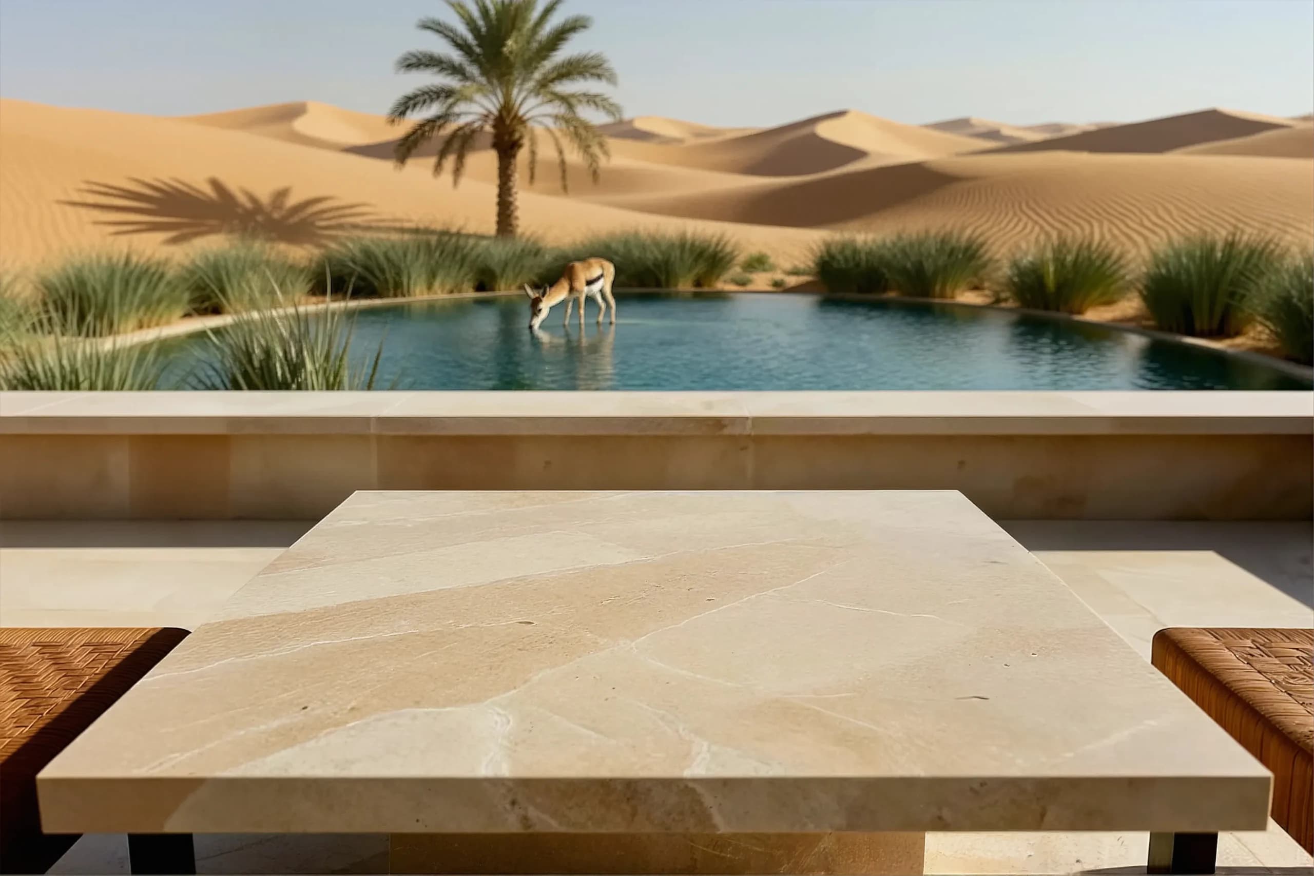
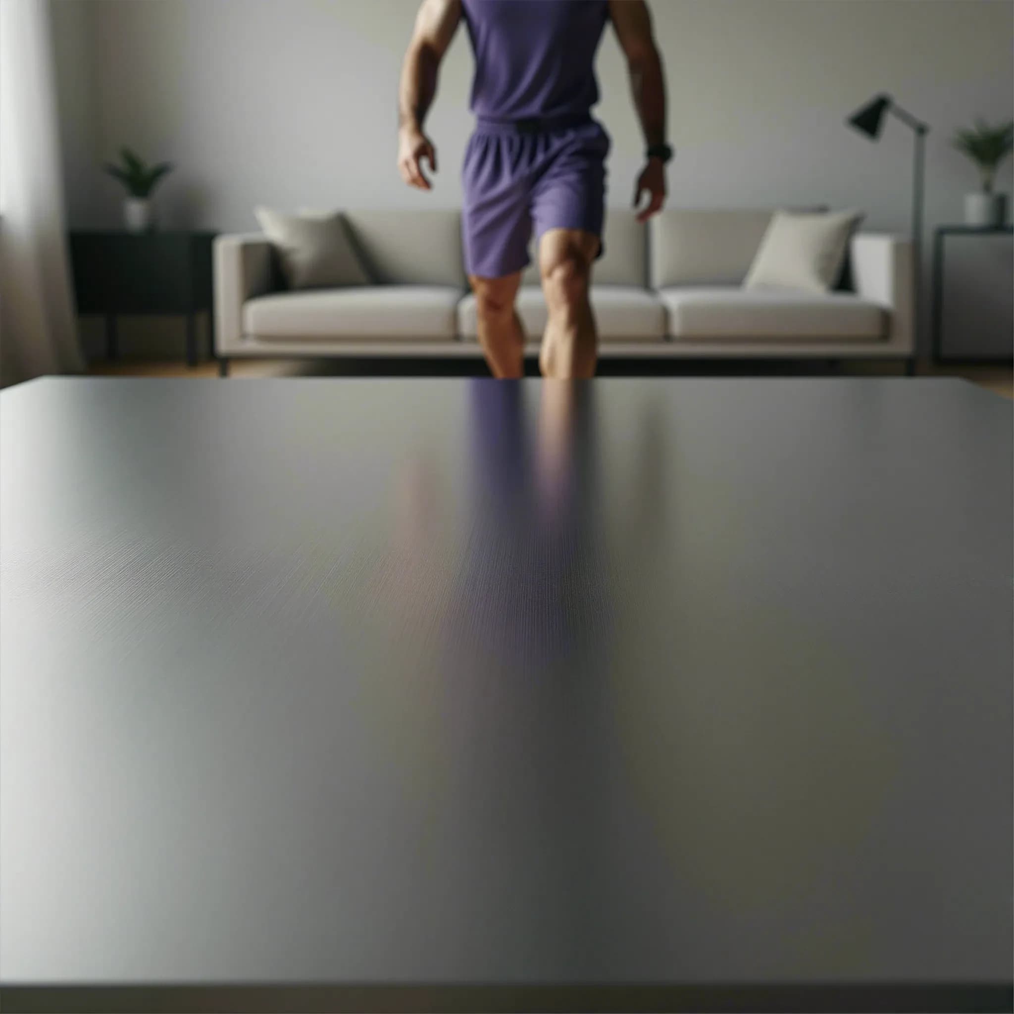
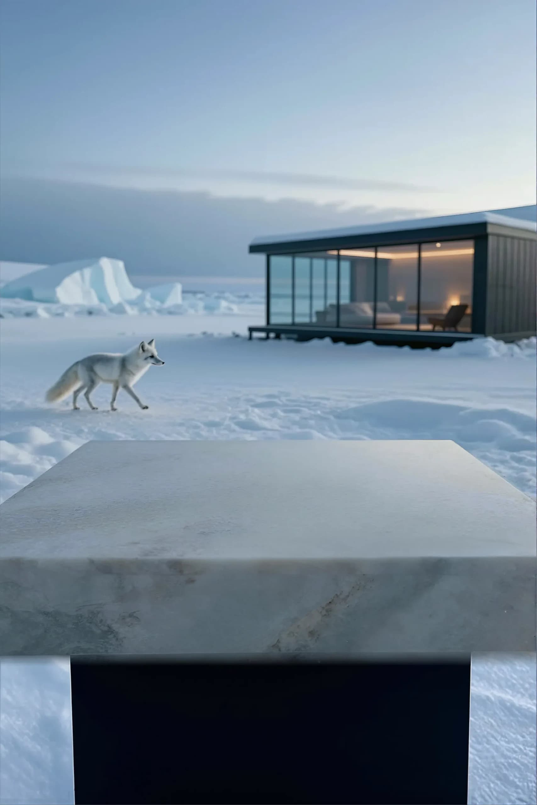
03 · Protect the message
Reserve the quiet upper band for the headline, supporting copy, CTA, navigation, and platform overlays. Keep the horizon and high-contrast detail from competing with the message.
Let the lifestyle story occupy the middle distance while the full foreground surface remains available for product placement, scale, and a believable contact shadow.
04 · Extend, never stretch
When the selected world is right but the frame is too narrow or short, extend the scene. Horizontal outpainting creates headline space; vertical outpainting protects foreground depth on mobile.
Review horizon, architecture, light direction, material seams, people, and repeated objects after every extension. Outpainting adds canvas—it does not replace a deliberate crop and final retouch.
05 · Deliver the right source
Export a clean master, then let the web layer serve responsive variants with accurate width descriptors and sizes. Art-direct with a separate mobile source when the composition changes.
Keep the likely LCP hero eager and discoverable. Lazy-load below-the-fold imagery, use modern formats where appropriate, and test gradients, reflections, skin, labels, and text-safe edges after compression.
| Placement | Useful ratios | Source starting point | Production note |
|---|---|---|---|
| Desktop website hero | 16:9, 3:2, or 21:9 | 1,920–2,880 px wide | Art-direct below 768 px |
| Mobile website hero | 4:5 or 9:16 | 860–1,290 px wide | Use a dedicated composition |
| Product or editorial card | 1:1 or 4:5 | 1,200–1,600 px wide | Preserve product breathing room |
| Email or campaign banner | 2:1 or 3:2 | 1,200–2,400 px wide | Test the actual email container |
Check 1× and 2× density without forcing mobile to download the desktop master.
Review the real viewport with browser chrome, navigation, copy, and CTA visible.
Measure transfer size and LCP on realistic mobile conditions before release.
Preparing images for Shopify? Keep product-gallery ratios consistent, check the crop in your theme, and resize your production master for the destination. Explore the Shopify product-image workflow.
06 · Release checklist
A full-resolution master can hide problems that become obvious in the actual page, card, email, or mobile viewport.